THE REPORTING SYSTEM
Because of the potential for explosions and their devastating results, Industrial America uses Non-Destructive Testing (NDT) to inspect and monitor their critical equipment. With respect to the inspection of power generation boilers, Ultrasonic Thickness (UT) testing is commonly employed. Thousands of UT readings are gathered and analyzed in hopes of determining the current and predicted condition of each boiler. The ability to digest and analyze the vast amounts of UT data gathered each year has long been a goal of most boiler engineers.
Since September of 1984, T. C. Ridgeway, Inc. (TCRI) has been dedicated to studying the results of UT inspections on Recovery boilers that are commonly used throughout the paper industry. TCRI is not a Non-Destructive Testing (NDT) lab and therefore does not perform the actual UT inspections. However, it does have a comprehensive understanding of both the technical and business sides of the NDT community. Please take a moment to study the following explanation of the TCRI reporting system that displays and trends the UT data. This paper is quite detailed and is intended for a person that has seen a full presentation of the Technical Database System (TDS) employing its quality assurance filters.
Imagine you are the junior engineer in the powerhouse and there upon your desk lies a two-foot-tall stack of 3-ring binders. The binders contain several thousand pages of UT data that represent nine years of inspections from the Recovery boiler at your mill. The number of UT readings in the stack is approximately 270,000. You are tasked with reviewing the data in hopes of predicting the remaining life of the boiler. In other words, you need a method of displaying and trending the data, such that your findings ACCURATELY represent the current condition and rate-of-change for any given boiler section.
The primary reason for conducting a boiler inspection is to identify immediate maintenance concerns. ie. which tubes need to be replaced during the inspection. The secondary reason for the UT inspection is to enable future maintenance and budget planning. Basically, you are trying to establish a future time window for which sections, if not individual tubes in the boiler should be replaced. To accomplish these goals, the UT inspection report used for boilers is based on four main objectives:
Objective #1 - Use multiple drawings to explain the boiler layout and inspection orientation. By doing so, the UT report is easier to understand and therefore the same inspection can be repeated next year, if desired.
Objective #2 - "Code" the UT data via a thickness legend in order to place a large amount of data on a single page. By doing so, the data is placed in “proper relative positioningâ€Â on the print. This means that when you look at the print, it is as if you are looking at the boiler wall. For example, the primary airports are below the secondaries, what is on the left side of the print is on the left side of the wall, etc. This holds true for all sections of the boiler. All UT data for a given boiler section displayed simultaneously and in its proper relative position is referred to as the "Static Image".
Objective #3 - Color the data on the Static Image to clearly show the WEAR PATTERNS and or INACCURATE UT data. This is where questions commonly occur, so this issue will be covered in greater detail later.
Objective #4 - Trend the data visually, as well as mathematically over the life of the boiler. Trending of data is desired for long term budget and maintenance planning. $$$. Even with the best software, meaningful trending is totally dependent on the accuracy of the UT data. This subject will also be addressed in greater detail later.
STATIC IMAGING CONCEPTS
Now that the four main objectives of reporting UT readings have been listed, lets go into detail with the coloring concepts of the Static Image mentioned in Objective #3. In order to explain the coloring or imaging concepts employed by the TDS, several points need to be made first;
Point #1 - Not all of the tubes in the boiler are manufactured to be the same original thickness, ie. nominal value. It is not uncommon for the lower furnace to have a high nominal, while the upper furnace has a lower nominal. Along the same lines, the superheater section may have multiple nominal values.
Point #2 - Not all of the tubes in the boiler have the same minimum allowable thickness value. The lower furnace may have a high minimum while the upper furnace has a lower minimum. The superheater usually has a number of minimums because of the temperature profile and metallurgical changes.
Point #3 - Some tubes in the boiler are close to minimum allowable because of wear, while others are close to minimum because of their design.
With these points in mind, the entire boiler is divided into what is referred to as "bell sections". By definition, a bell section is a section of the boiler where the minimum and nominal values do not change. The front water wall normally has two bell sections because of the traditional weld line and resulting nominal value change. The mathematical difference between the minimum value and the nominal value for a given bell section is calculated. For example, if the minimum is .100" and the nominal is .180", the mathematical difference or delta is .080". The delta value is then divided by five to determine how many steps of .005" are present. Each step of .005" is assigned a 36 by 42 dot pixel pattern on the UT Static Image report. By our definition, a pixel pattern is made up from 1,512 different colored dots for each character cell on the large color printout. The UT value code is contained within the character cell and is easily converted to a UT reading via the tube thickness legend.
Based on how boilers are designed, only 36 different pixel patterns were needed to render the Static Image of any section of the boiler. A UT value less than minimum allowable is represented by the 1st pixel pattern which is a solid red rectangle with a white UT code inside. The 2nd pixel pattern is solid black with a white UT code. The 3rd up to the 35th pixel pattern gets lighter in color and less dense as the UT value increases. The 36th pixel pattern is simply the code representing the largest UT value in the bell section being imaged. The UT code is printed in the color cyan. If a given bell section of the boiler has a small delta, ie. superheater, only a small number of the pixel patterns are needed to render the proper image of the data. On the other hand, if the delta is large, ie. lower furnace, a greater number of pixel patterns are needed to render an image of the data. Whether the delta is large or small, each spectrum of pixel patterns all start at the same place and end at same place on a visual scale.
What does this accomplish? For every .005" change in the UT data, there is a visual change on the color Static Image of the boiler report.
What does that mean? It means the TCRI boiler report automatically draws your attention to the wear patterns in the boiler and not to areas that are thin due to design. In other words, when you view the report and see a dark area, it is because of wear and not because the tubes were built that way. With this concept in mind, you can review a very large UT report in just minutes. If you do not see dark areas in the report, you do not have a problem in the boiler. It is that simple! You are also able to see when the UT technician is out of calibration. This characteristic becomes very handy if "working copies" of the report are being produced during the inspection while the manway is still open.
What does all of this NOT mean? It does not mean that any given pixel pattern has a specific UT value assigned to it. For example: a specific pixel pattern in the superheater section may be attached to the UT value of .100", while the exact same pixel pattern in the lower furnace may be attached to a .200". There are multiple bell sections throughout the boiler, each of which have different delta values. Therefore, a given pixel pattern can be attached to a multitude of different UT values throughout the report.
If this is true, how can the mill engineer keep track of what the pixel patterns mean with respect to the UT data. A very good question! The answer is simple. The engineer is NOT supposed to keep track of what each pixel pattern means. The following short statement is all the engineer needs to remember;
THE DARKER THE COLORS, THE CLOSER THE TUBE IS TO
ITS MINIMUM ALLOWABLE THICKNESS. IF THE TUBE GOES
BELOW THE MINIMUM, THE COLOR TURNS SOLID RED.
If all of the above seems confusing, look at it this way. How many engineers go through the full mathematical derivation of the trigonometric functions such as sine and cosine when they need them? There is no need to! They simply push the appropriate buttons on their calculator and carry on.
The rendering and reporting of UT data as described here is a very unique and powerful tool. If used during the inspection, the Static Image greatly increases the probability of acquiring a set of UT data that lends itself to meaningful trending.
RATE IMAGING CONCEPTS
Just as UT data can be displayed as a Static Image, so can the rates-of-change for each individual location be displayed as an image. The historical UT data values for each single location of a particular boiler section is plotted on a thickness-vs-time plot and the “Sum Of The Least Squaresâ€Â line calculated. The slope of the line represents the rate-of-change in tube thickness. The degree of slope determines a color for each location. When the locations of the boiler section have been assigned a color, they are all presented simultaneously. This simultaneous display of all the individual rates is called the “Rate Imageâ€Â.
The colors are defined as follows: If the Least Squares line has a positive slope and is the result of data varying to a large degree, the location is YELLOW on the Rate Image. If the line has a positive slope and is the result of data varying to a small degree, the location is GRAY on the Rate Image. If the line has a negative slope, the location is BLUE on the Rate Image. As the slope of the line becomes more negative, the blue becomes darker.
When the concepts of the Rate Image were established, we thought it would be the solution to the trending objective. The user would be able to SEE areas of high wear and trend only those areas. However, as with most roses, a thorn usually comes along as well. The existence of the Rate Image brought up many questions that did not exist in the past. When viewing and interpreting the Rate Images, we noticed big changes in the rate values that came from areas in the boiler that are physically near each other. For example; two test bands that are only a foot apart on a wall, would have vastly different rates-of-change. The first test band would have a loss of .001" per year while the second would have a loss of .008" per year. Also, we were seeing test bands that would have positive rates-of-change because of systematic errors in the data. By definition, a systematic error is when an ENTIRE test band is .020" to .040" different in thickness as compared to surrounding test bands. We quickly realized that a believable wear area on the Rate Image is one that has a gradual change in the rates as the wear pattern diminishes. A nice feather edged pattern is one that has a high degree of accuracy. Unfortunately, that type of pattern very seldom was seen. This led us to believe that most UT data is not accurate enough to yield meaningful trending. Knowing this conclusion would not be accepted well, we sought a more refined method of trending the UT data.
As a result of the Rate Image, we became aware that UT data is not as accurate as Industrial America would like for it to be. We also know, even though a lot of the UT data does not lend itself to meaningful trending, SOME of the data actually does. Therefore, an "Expert System" rule base was developed that would define GOOD data. We knew the following points to be factual:
Fact #1 - UT data is not perfect because of the numerous variables that affect its accuracy. The further each UT reading is away from the Least Squares line, the higher the margin of error, thus the less meaningful the rate-of-change.
Fact #2 - The Least Squares line for any given location should have at least four time periods associated with it. This causes the inaccuracies of the data to mean out more so than if only two or three inspection dates are used.
Fact #3 - Boiler tubes do not actually get thicker with time. Therefore, a positively sloped Least Squares line should not occur. However, because of the inherent inaccuracies in UT data, slightly positive lines do occur within commonly acceptable tolerances and therefore are considered valid.
Before continuing, please Refer to Figure #1. Based on known boiler tube wearing characteristics and the Least Squares algorithm, plot "B" is considered the most accurate. We know that tubes do not grow (plots "A" and "D") and that a tight grouping of UT data yields a small margin of error (plot "B" instead of plot "C"). Considering these facts, it can be said that GOOD data has a slightly positive or negatively sloped Least Squares line and a small margin of error.
Now that a definition of good data has been established, the objective is to extract the good data from the overall body of 270,000 UT readings. Once the good data has been extracted, analysis functions can be performed on it to evaluate the condition of the boiler.
EXTRACTION OF GOOD DATA
All of the individual UT locations presented on the Rate Image have their own margin of error. The margin is small when the historical thickness values fit tightly around the Least Squares line. The “Margin Imageâ€Â shows all the locations for a given section of the boiler and visually indicates which locations fall within the acceptable margin of error as defined by the boiler engineer. The color scheme is brown and as the margin of error gets larger, the darker the brown becomes. When the margin of error for each location increases to the engineer’s specified criteria, the location turns RED on the Margin Image.
In order to extract the GOOD data from the overall body of data, the following steps via the TDS boiler module is necessary;
Step #1 - Set-up and render a Rate Image for any given section of the boiler.
Step #2 - Define the acceptable Margin of error, then Create the Margin Image from the Rate Image.
Step #3 - Merge the Rate Image and Margin Image to create the “Composite Imageâ€Â.
The Composite Image is a Rate Image formed from only the UT locations that have a small margin of error. If the Composite Image has few or no locations, you can run the "Robust" function on the Rate Image prior to creating the Margin Image. See Figure #2. This function minimizes the margin of error for each location by ignoring a single historical UT reading that causes the large margin of error to occur. The result is that the Composite Image contains only the locations that meet the definition of GOOD data.
ANALYSIS OF GOOD DATA ONLY
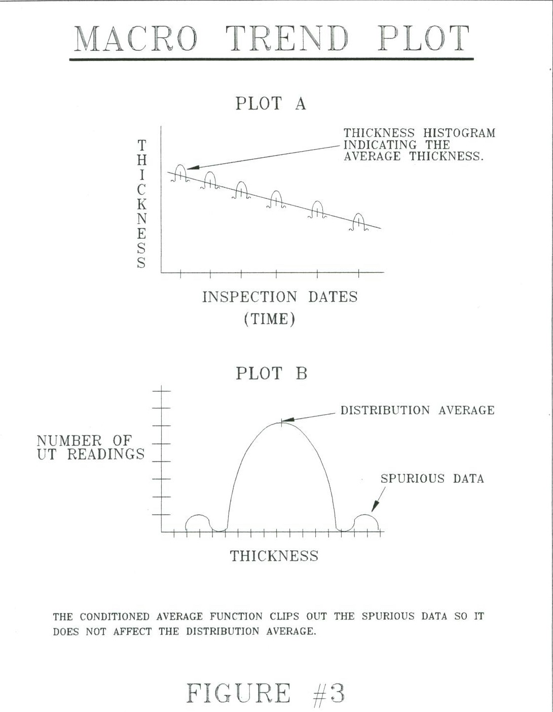
Once the Composite Image exists, you are able to perform a variety of analysis functions on it. You can trend a whole wall, a single UT location, or anything in between. Area trend plots are referred to as MACRO trends, while single location plots are called MICRO trends. When you run a macro trend from the Composite Image, it is advisable to run the "Conditioned Average" function to eliminate any spurious data prior to averaging the data for each time frame. See Figure #3. By definition, spurious data is any data more than two standard deviations away from the average.
With a known rate-of-change, future time periods can be specified and the projected thickness values calculated for each location. When the individual thickness values are presented simultaneously, they form the "Future Static Image". This image indicates which tubes will be below minimum allowable tube thickness at the specified future time period.
After evolving for nearly twenty years and participating in hundreds of on-site boiler inspections, the TDS is more than technically capable to manage the UT data. The TDS software turns the “very complexâ€Â into the “easily understoodâ€Â.
Create the Rate and Margin Images. Merge them together to yield the Composite Image. Perform trending on the Composite Image to predict the future. Its that easy!
The most important feature of the TDS, is its ability to place the UT data in the proper relative positioning to form the various images. For example; by displaying the rate-of-change values for all locations simultaneously and in the proper relative position, much more information can be seen. You are able to easily identify areas of high wear and submit those areas to the array of analysis functions. Because of the Rate Image, you know WHERE in the boiler to trend. Also, because of the ability to extract the good data, you know WHAT data to trend.
The power and versatility of the TDS Boiler Program is quickly recognized when the system is demonstrated. If all of the functions are employed, the final Least Squares line should more closely represent the actual rate-of-change in the boiler. As a result, budget and maintenance planning has more meaning and is now an achievable goal provided the data is not grossly in error.
The many variables that affect the accuracy of the UT data must be addressed before trending can be widely and accurately employed. TCRI firmly believes that analyzing UT data starts well BEFORE the inspection is ever conducted. Even with good pre-job planning, it is advisable to employ the Static Images during the inspection so systematic errors are recognized and corrected while the boiler is still shutdown for inspection.